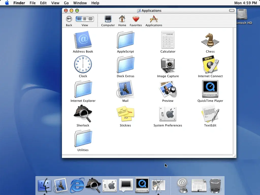
Helvetica Aqua Aero Aesthetic
Helvetica Aqua Aero, also known as Frutiger Aqua, Aquacore, Low Frutiger, or simply Helvetica Aqua, is a Frutiger Aero sub-genre characterized by its use of imagery related to tropical water environments. Common motifs include aquatic life, bubbles, water, and other key elements of the ocean. Helvetica Aqua combines these elements with shared aspects of Tropicalcore and Frutiger Aero, such as glossy textures, futurism, 3D rendered objects, gradients, and tropical themes, creating a midpoint between the two aesthetics.

Visual Characteristics
The visuals of Helvetica Aqua revolve around imagery related to the sea, the ocean, and beach environments. This aesthetic often features common aquatic creatures such as fish, dolphins, and whales, but seagulls and butterflies are also used, similar to Frutiger Aero. The colors used in this aesthetic are often shades of blue, green, and yellow, evoking the colors of its inhabitants and seascapes. These elements are combined with shared aspects of Tropicalcore and Frutiger Aero, such as glassy textures, gradients, fish, and other tropical imagery. Other common motifs include sandy beaches, palm trees, and seashells. Helvetica Aqua is considered a sub-genre of Tropicalcore due to the fact that they both center around the sea and aquatic life while also using the same visuals and presentation style as Frutiger Aero.
It is important to note that unedited or unaltered pictures of the ocean are not considered Helvetica Aqua. Similar to Frutiger Aero and Y2K, it is typical for an image or piece of media classified as Helvetica Aqua to be edited in some way or include CGI elements.

Evolution and Popularity
Helvetica Aqua originated in the early 2000s, following the decline of Y2K and the rise of Frutiger Aero. The aesthetic likely gets its namesake from Apple's Aqua UI, similar to how Frutiger Aero and Metro derive their names from the design languages used in Windows 7 and Windows 8, respectively. Due to its dreamy, aquatic, and gloss-based visuals, Helvetica Aqua was incredibly child-friendly and was frequently used in products and locations designed for young children during its prime, such as children's hospitals and toys. Helvetica Aqua was also utilized in the corporate scene, featuring sleeker and cleaner visuals, as well as utopian and joy-themed imagery.
Helvetica Aqua remained popular throughout the late 2000s but began to lose its mainstream appeal in the early 2010s. During its decline, the more corporate side of Helvetica Aqua became more prominent than the variant marketed towards children, which embodied a more 'anything goes' mindset. This shift was due to the gradual phasing out of Y2K influences as the years passed. By 2013, Frutiger Aero was in decline, and by 2017, Flat Design had become the dominant design philosophy of the era.


 What is Helvetica Aqua Aero?